Glo Kluuvi

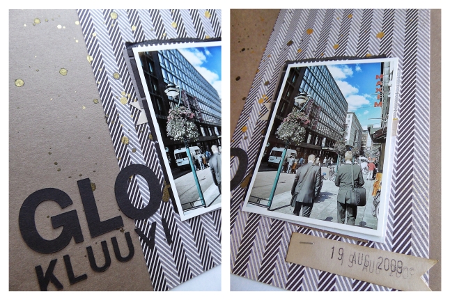
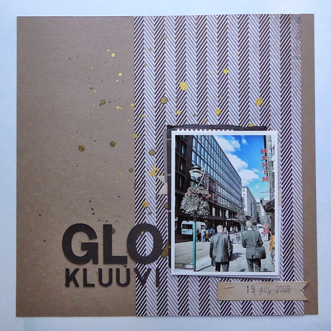
This week’s throwback layout is a simple one. One photo, one solid background paper, one patterned paper, minimal layering and embellishments, and a simple block font title. I took inspiration from the building in the photo – very minimal, and very rectilinear.
Glo Kluuvi

Glo Kluuvi

tlun 2014-07-throwback glokluuvi 05I kept to a neutral colourway, and used a patterned paper that is reminiscent of a herringbone men’s suiting fabric. Both of those choices give this page a slightly more masculine look, which works well with both the architecture and the two business men in the foreground. I added a few layers to anchor the photo and add a touch of black to the upper part of the page. I added ink splatters with Heidi Swapp’s Color Shine mist in gold. I like how the the shimmer of the mist relates to the shine of the glass on the building. And after all, a little bit of bling never hurts a layout.

Documented

It’s another throwback layout – another one from my gallery at Two Peas in a Bucket. This one was made as part of a challenge where you were to scraplift a layout from another member. Now that the site has closed down, I can’t give proper credit to the person who came up with this layout design. If it was you, or you know who it is – let me know! I’d love to give them proper credit, and I’d really love to see all the new projects they’ve created.

Documented

Documented

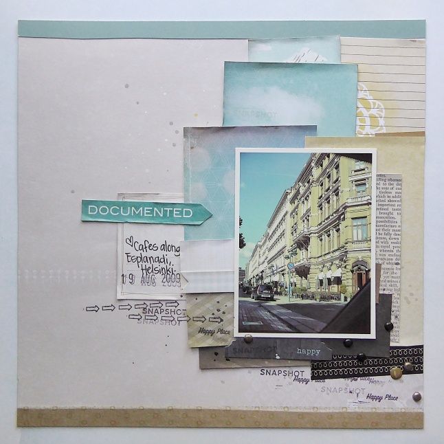
tlun 2014-07-throwback documented 04This photo is from a trip to Helsinki, Finland. The layout I was scraplifting used coloured papers and embellishments matching the colours in the picture, to extend the colours of the photo past the frame of the photo itself. I thought it was the perfect layout to lift because the colours in my photo are so distinct. The dark grey and blacks of the road, the blues of the sky, and the golden taupes and creams of the buildings. Looking at this layout I’m reminded of all the inspiration I found at Two Peas, and realizing that our projects hold the memories both of the photos we use and the process of making the page.

Wander

This week’s throwback layout includes a photo from my first flight overseas. I absolutely love flying, and I’m probably one of the few people who hope for long flights. There’s nothing I don’t like about flying. Humans have only been able to fly since 1903. It’s amazing how it has opened up the world for all of us – the places we can go, the experience of seeing the world from so high up.

Wander

Wander

tlun 2014-07-throwback wander 04I left a lot of open space in this layout. It just felt right to avoid adding too much around a photo that shows nothing but our plane in the atmosphere. I kept all the embellishments on a horizontal axis – letting the photo be the strong vertical element, and kept the majority of the embellishments to simple designs and soft colours. I used my Silhouette to cut the line of hearts out of Martha Stewart cardstock, and to cut clouds out of vellum. The tabs were punched with We R Memory Keepers Tab punch (large tab), and a Quickutz die (small tab). I think my favourite trick on this layout are the blue clouds. I fussy cut those from some plastic packaging – the beauty of recycling!

Going Home

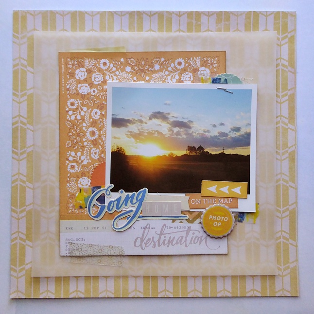
Today’s throwback layout isn’t really that old, but it sat unfinished for a long time. I love this photo. It’s a photo I took on my drive home from work, on one of those days when the sky is clear and blue, with the perfect amount of cloud. When the sun is setting and all golden, warm, and soft. It was the kind of drive home I wish I could have every day.

Going Home

Going Home

tlun 2014-07-throwback goinghome 04Most of the embellishments on this layout are from Crate Paper’s The Open Road collection. The blue and yellow washi tape was a recent purchase from Indigo, while the others were older tapes from my rather large washi stash. I tried to keep the colorway limited to muted warm yellow tones, with just touches of blues to add contrast and energy to the page. I really wanted the photo to speak for itself, with the layout backing up the mood of the photo.

Wild Blue Yonder

This is a layout that I did a couple years ago. I used to keep track of my layouts on Two Peas in a Bucket, and it was posted there originally. I really liked the gallery there. Being able to see the progression my scrapbooking – of things I had learned, and different techniques I had tried. When Two Peas announced their closing, it was a mad scrabble for a lot of us to figure out how we would keep track of our projects. Even though we have the layouts in albums around our homes, it was always just so convenient to click through the galleries.

Wild Blue Yonder

Wild Blue Yonder

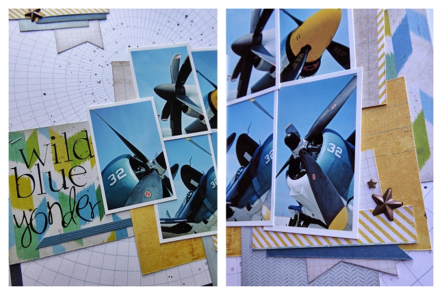
tlun 2014-07-throwback wildblueyonder 05This pattern paper (I believe it’s a Studio Calico print), jumped out at me right away. I love how the circular graph reminds me a bit of charts and maps, and how it relates to the circular nose of the airplane with the propeller blades radiating out from the center. Again with this layout, I pulled my colours from the photos. The print under the title reminds me of the way blades blur when they’re in motion, and I like the addition of green to the layout. Green softens the combination of blue and yellow, letting the bold blue and yellow of the plane stand out. This is an 8×8 layout and I’ve included five photos, so I decided to keep the embellishments simple and minimal. I kept the title simple as well – using rub-ons from Making Memories. I didn’t include any journalling in this layout, but it would be easy enough to tuck hidden journalling under the cluster of photos or a quick line or two in the upper left corner or under the title. It’s a very versatile, easy, and quick layout for including lots of photos – a layout I consider a staple.