Stamp Press / Positioner – in time for card making season…

I refuse to mention that people are planning christmas cards already… Just no… The cicadas are singing and I’m sleeping with warm breezes coming in the windows… So, no… Nope…

On to the post… I have been really sporadic on here lately… Partly because of life stuff, and partly because I’ve been trying to organize my space, computer, photos, and figure out how to film, edit, and upload videos… Almost organized… Almost have the film-edit-upload thing down… Almost… Still trying to figure out the lighting… Shadows and glare, oh my!

I did want to make a video showing how I use my WRMK Letterpress platform as a stamp press/positioner… It’s not pretty, but I show you the nitty gritty on how it works… And, I show you how to make a magnetic grid insert, different ruler options, and how it works with clear and rubber stamps…

Spoiler alert: it works AMAZING! It’s available a bunch of places, goes on sale, you can use coupons, and it also does that whole letterpress thing too! (You need a manual die cutter to do letterpress, but not to use it as a stamp press…)

I think I answer most questions in the video, but if you have some that I didn’t answer – just ask… Happy to help if I can…

Enjoy!

YouTube WRMK Letterpress as Stamp Positioner


Clouds

I had so much fun making this layout! I usually watch some YouTube process videos or click through Pinterest when I’m playing around in my scraproom, but ended up making this one while listening to music. There was something a bit scary but also a carefree feeling about putting together a layout without having inspiration right in front of me. I told myself that I’d stick some stuff down and just toss the whole thing if I didn’t like it. The experience took me right back to cut and paste as a child, and the almost meditative state I’d be in when I was creating something for enjoyment and not show. 

Scrapbooking has a lot of hidden pressures. You’re doing it to record important memories for generations to come, so it has to be perfect. You spend time and money on it, so the results better be worth it. And then the people who don’t get it, and think it’s a childish hobby to have. 

This layout was a reminder for me that childish cut and paste is meditation for me. As a child, I would loose track of time if I was near paint and paper. My parents used creative arts as a way to distract me, calm me, reward me. I’m decades older, but paper, scissors, and glue still center me. 

   
The background paper is Heidi Swapp specialty catdstock that I coloured with Tim Holtz Spun Sugar, Abandoned Coral, and Punice Stone distress inks. I also used his Broken China stain dauber for a couple spots of blue. 

The clouds are from October Afternoon’s Summertime stamp set, and I used Hero Arts Ombré in Pool to Navy, and Memento Tuxedo Black. I stamped them on scrap paper and fussy cut them.

The letter stickers are an old Recollections font, and the brads and enamel dots are from My Mind’s Eye.

Butterfly

After more of an absence than I expected, I’m back! I’ve been trying to learn how to film process videos, and how to edit and upload them. Have joined Instagram, joined YouTube. I still need to update my blog so that there are quick links for you guys to find me all those places, but in the meantime I’m The Light Up North in both places. 

I’m also trying out posting blog entries from my phone. This will be my first post using the WordPress app, so we’ll see how it goes. What I really love about the blogging, Instagram, and YouTube, is the community. How much fun it is to share with others the projects we’re working on, products we love, design ideas, and the stories that are special to use. I’m hoping that I’ll be happy with the quality of the posts I make through the app, making it easier to keep things current and interesting.

So, finally onto the layout. I was driving downtown when a butterfly flew in my car window and landed on my arm. It stayed their for over twenty minutes, checking out my shirt with it’s proboscis and just chilling. It was so delicate that I was sure it would blow away with the wind coming in while I was driving, but it hung on.  

Butterfly

   
I cut a circle with my Martha Stewart Circle Cutter, then cut pie shaped pieces out of it to create a pie chart. I filled in the pie chart with pieces from Heidi Swapp’s September Skies 6×6 paper pad. The building die cut is a die from Studio Calico that I ran through my WRMK Evolution Advanced die cutter. Some washi, some enamel dots, and some stamping with roller stamps filled out the embellishment clusters. I did my journaling in Becky Higgins Project Life app, and then sent it straight to my printer from my phone – too easy! 

  • Heidi Swapp, September Skies, 6×6 paper pad
  • Martha Stewart coloured cardstock
  • Martha Stewart Circle Cutter
  • WRMK Evolution Advanced
  • Studio Calio buildings die
  • Studio Calico + Life.Love.Paper buildings stamp set
  • Tim Holtz, Pumice Stone Distress Ink
  • Ranger, foam blending tool
  • Tsukineko, VersaMagic, Niagara Mist chalk ink
  • Tsukineko, Memento, Tuxedo Black
  • Recollections, Simply Pastel alpha stickers
  • Doodlebug Design Inc., Sprinkles, Limeade Glitter

Room Service

I had a bunch of stuff on my desk from my last Studio Calico order and this picture of a room service dinner from one of my favourite hotels. I love the Studio Calico stamp and die sets that are coming out now that feature different continents. I wanted the Europe one as soon as I saw it but it was out of stock. As soon as I saw they had it back in, I ordered it right away. If you’ve been waiting too, you can find it here.

Room Service

Room Service

tlun 2015-05 roomservice 04

The background paper was a piece I found in the far back of my scrap basket. It had a pale grid and texture print on it that kept the layout looking more casual than it would have with a pure white cardstock. I stamped the Europe stamp onto some glassine/tissue type paper with some watermark ink and then added gold embossing powder. I like the effect it gave even though it was a bit less crisp that if I had stamped it on vellum. I added a bunch of transparent layers with washi tape and acrylic die cuts, and some graphic touches with multiple stampings of black ink.


Products:

  • My Mind’s Eye, Necessities, Black & Grey 6×6 paper pad
  • Studio Calico, 3×4 card
  • Studio Calico, Europe, stamp set
  • Tsukineko, VersaMark WaterMark ink pad
  • World’s Greatest Embossing Powder, Ultra Detail Mirror Gold, embossing powder
  • Marvy heat gun
  • Tim Holtz, Distress Ink, Pumice Stone
  • Ranger, foam blending tool
  • American Crafts, Amy Tangerine, Cut & Paste, One Two Three
  • Studio Calico, Aloha stamp set
  • Studio Calico, Zeus stamp set
  • Tsukineko, VersaFine, Onyx Black ink
  • EK Success, Triple Heart Punch
  • Recollections, Fall, brads
  • Studio Calico, Silver Glitter letter stickers, Tiny Alpha in yellow, and acrylic die cut
  • misc. washi tapes and sequins


Put A Ring On It

Last week’s NSD (ISD?) activities tuckered me out! I was under the weather and couldn’t quite get as involved as I wanted, and missed posting something up here. I do have a couple of layouts to post and play catch up though…. Let’s get started!

This first layout has a photo I took at a friend’s wedding. It never fails, if it’s a big occasion – wedding, birthday, Christmas, I don’t take my normal hundreds of pictures. I go to the mail box and take more pictures than I do during big life moments! Argh! I’m going to say that I get caught up in the moments and am just too busy enjoying myself to click the shutter. Yeah, that’s it.

So, at my friend’s wedding and I take maybe a couple dozen pictures. The handful that turned out include two of a young boy that was peeking over the fence at the ceremony in progress, one of the patio (the actual patio – I was planning my own backyard projects at the time), and this one. This one definitely falls into the category I call “story pictures”. It’s one of those photos that has no meaning, no context, no interest to anyone and you have to say, “oh – let me explain….”

The explanation: when the band started to play, the room was lit in just violet lights and candles. It was such a pretty moment, it felt like everything was glowing. I love that the candle and flowers is in focus and the dance floor and band are part of the haze.

Put A Ring On It

Put A Ring On It

tlun 2015-05 leiki wedding 04The layout is pretty simple. I didn’t want to add too many details or embellishments because I wanted to keep the ethereal feel of the photo. I added the gold edge to the layout by running a watermark ink pad along the edge of the paper and then adding gold embossing powder. I love the organic, imperfect look it created. I don’t usually use ribbon but I did this time, so even on a basic layout I managed to try something new.


Products:

  • Studio Calico, white cardstock
  • My Mind’s Eye, On Trend, 6×6 paper pad
  • Altenew, Vintage Roses stamp set
  • Altenew, Vintage Roses die set
  • Tsukineko, VersaMark, WaterMark ink pad
  • Tsukineko, VersaMagic, Red Brick chalk ink
  • Tsukineko, VersaMagic, Perfect Plumeria chalk ink
  • Tsukineko, VersaMagic, Purple Hydrangea chalk ink
  • World’s Greatest Embossing Powder, Ultra Detail Mirror Gold embossing powder
  • My Mind’s Eye, Fancy That, Pearl stickers
  • We R Memory Keepers, Evolution Advanced die cutting machine
  • Marvy heat gun
  • Imaginisce rhinestone heat setting tool


Here And Now

I’ve got another Fallingwater layout this week. You can check out the previous three layouts here, here, and here. If you want to check out the Fallingwater live cam here. You get the iconic view of the home, in all seasons, and at all different times of the day.

This photo is taken from halfway up the walkway between the main house and guest house. You can see the stepped cover over the walk, and the full and lush rhododendron bushes that grow all over the site. As is usual with Wright’s designs, the entrance to the house is tucked away and not visible until you’re right in front of it. It adds a wonderful feeling of seclusion and privacy, as if it’s a secret place that only you know the way into.

Here And Now

Here And Now

tlun 2015-03 hereandnow 04

Keeping in line with the other layouts from this trip, I kept to a narrow colourway of neutrals with an accent colour that references the photo. In this case, the ColorMagic die cuts from Heidi Swapp were perfect. The leaves look natural on the layout, and remind me of all the rhodedendrons we saw that day.


Products:

  • Recollections, kraft cardstock
  •  My Mind’s Eye, Follow Your Heart, Be Happy
  • American Crafts, DIY Shop, Gold Foil on Black
  • Staples, shipping tag, size 5
  • Sookwang, Scor-Tape
  • Crystal Glitter Ritz, Warm Highlight
  • Heidi Swapp, ColorMagic, die cut embellishments
  • Peerless Watercolors, Olive Green and Myrtle Green
  • Heidi Swapp, ColorShine, Bronzer
  • Crate Paper, Notes & Things, Ephemera Pack
  • Tsukineko, VersaMark, Watermark ink
  • Tsukineko, Sheer Shimmer Spritz, Frost

This

This is the third layout featuring a picture from Fallingwater. You can check out the first two layouts here and here.

The view in this photograph is from the main house, looking up the hillside to the guest house. The two buildings are connected by a covered walkway, formed by one of the few curvilinear lines Wright used in his design. Most of the views are directed towards the water, but this view looking to the hills is beautiful.

This

This

tlun 2015-03 this 04

Another simple layout with a narrow colourway. I ran a 4×6 journalling card through my printer for the journalling. If I’m going to add journalling, I love using my printer to do it so I can choose the font style, size, and formatting I want. To make the title, I ran some adhesive backed cork through my die cut machine. It was easy, and worked perfectly – crisp, sharp edges and no tearing. To finish it off, I added a couple metal staples, wood stars, and a subtly metallic horizontal line of paper.


Products:

  • Recollections, grey cardstock
  • My Mind’s Eye, Indie Chic, Ginger “Pictures” Flourish
  • Becky Higgins, Midnight Edition Kit, 4×6 journalling card
  • Crate Paper, Maggie Holmes, Open Book, “this” die
  • Karen Foster Design, adhesive cork sheet
  • We R Memory Keepers, Evolution Advanced die cutter
  • Tim Holtz, Tiny Attacher
  • Studio Calico, wood veneer stars

Brilliant Fallingwater

Another post about on of my favourite places. Actually, this whole month will have layouts of this place. You can check out last week’s post here.

This layout includes a photo of one of the first view’s of Fallingwater you get when you walk the path from the Visitor’s Centre, down the hillside, and along Bear Run. You start by seeing parts of the home between stands of trees, and when you get to the bridge that takes you over the creek, this is what you see. Those iconic cantilevers floating over the water, before the water drops over the edge of the waterfall. It’s this moment when you realize you’re standing in front of the building you’ve seen in thousands of photographs. All of a sudden this feeling of a life size cardboard cutout coming to life floods your brain. It’s an amazing moment.

Brilliant Fallingwater

Brilliant Fallingwater

tlun 2015-03 brilliantfallingwater 04

Again, a simple layout without a lot of ornamentation. And again, a narrow colourway that references the photo. I purposely matted the photo in a paper with a pure white background instead of an off white or beige colour. I wanted the photo to stand out – to be bright and alive and in contrast with the papers of the layout. I also added in a few white rub-on details just to confirm that I purposely chose white.


Products:

  • Authentique, Hope, Foundation One
  • Sticko, Nostalgiques by Rebecca Sower, architecture stickers
  • Basic Grey, bas-3984, letter stickers
  • Basic Grey, Transfers “Obscure”, rub-ons
  • Heidi Swapp, “Brilliant” clear stamp
  • Tsukineko, VersaFine, Onyx Black ink
  • Tsukineko, VersaColor, 171 Pinecone ink
  • Tsukineko, VersaMark, Watermark ink
  • Staedtler, Triplus Fineliner, light grey
  • date stamp

Fallingwater Cafe

A little warning – this post will be longer than most. I love, always have loved, Frank Lloyd Wright and Fallingwater, and tend to ramble when I come across a chance to talk about them. :)

During the road trip of 2005, we also visited Frank Lloyd Wright’s most famous design, Fallingwater, near Mill Run, Pennsylvania. It consistently makes the lists for places to visit before you die and most recognizable buildings in the world, has been featured on the cover of Time Magazine, and has recently been nominated to be placed on UNESCO’s World Heritage Sites list. The home, and Wright, provided inspiration for the Vandamm residence in Alfred Hitchcock’s North By Northwest, and inspired Ayn Rand when she created the character of Howard Roark in Fountainhead. It is a captivating piece of architecture that includes design elements that continue to be on the edge of what is happening now. It’s timeless, and gorgeous, and anyone who loves architecture or design will love how the site is cared for and protected.

It’s set up so that you can walk through the main home and the guest house with a guide. The guides are wonderful – they know the history, the facts, the rumours, the stories, and it’s obvious they have a passion for the place. There are also trails on the grounds that you can walk along unescorted, and getting to see the home from various points on the hills around Bear Run.

We opted to buy tickets for the longer tour that allowed visitors to take photographs and I’m so glad we did. We also set aside the whole day to be there, and that let us wander the paths and enjoy some time in the beautiful Visitor’s Centre. The Centre is in a pavilion designed by Spanish architect Paul Mayén. It too has been recognized for how well it blends in with it’s surroundings, and is the perfect compliment to the site and to Wright’s intentions for it. There is also a lovely cafe and gift shop, and places to sit and relax before or after your walk.

Fallingwater Cafe

Fallingwater Cafe

tlun 2015-03 fallingwatercafe 04

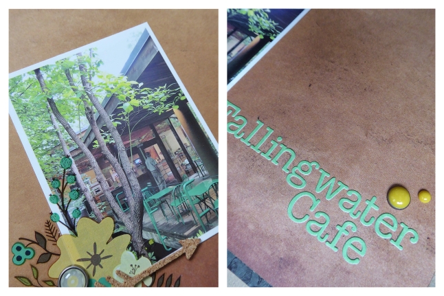
I made such a simple layout for this photo. Partially because images from this day bring up so many full memories that I don’t feel the need to add much, but also because Wright disliked too much ornamentation and it felt wrong to ‘cluttering up’ something that had been so perfectly designed in the first place. Odd? Probably… :)


Products:

  • Recollections, kraft cardstock
  • Glitz Design, Uncharted Waters, Scallop
  • Teresa Collins, Nine & Co., Rub-Ons
  • Jenni Bowlin Studio, Canning Jar Fun, Rub-Ons
  • Basic Grey, letter stickers
  • American Crafts, DIY Shop, Cork Sticker Arrows
  • Ranger Foam Blending Tool
  • Tim Holtz, Distress Ink, Pumice Stone
  • My Mind’s Eye, The Sweetest Thing, Bluebell, round brads
  • My Mind’s Eye, The Sweetest Thing, Bluebell, enamel dots
  • My Mind’s Eye, Now And Then “Milo”, Inspired, enamel dots
  • My Mind’s Eye, Collectable, Notable “Cute”, enamel dots
  • Tsukineko, Memento, Tuxedo Black ink


Lake Erie

This is another photograph taken at Presque Isle State Park (check out last week’s layout here). This was a beach at the east end of the park, that just sort of appeared between the trees while we were walking the trail and looking at the lighthouse. It was such an incredibly hot summer day. I still don’t know why this beach was empty, except that maybe it was so hot that everyone stopped at one of the many other beaches that we passed earlier on the trail.

Lake Erie

Lake Erie

tlun 2015-03 lakeerie 04

I find that one of my habits is the use of limited colourways in my layouts. It’s a look I like, and it’s something that comes easily for me. Using shades of brown and blue-green were a natural fit for this photo. To avoid having a narrow colourway look too simple, I always use a variety of shades. The browns include everything from a pale, off white beige, to a deep, cocoa brown. The blue-greens range from an almost true green to a turquoise. That variety helps add dimension, and the use of multiple patterns helps add interest. Everything from solids, to geometrics, to textures, to florals. They all add lines and weights that keeps your eye engaged.


Products:

  • American Crafts, white cardstock
  • We R Memory Keepers, Simply Spring, Sprout
  • We R Memory Keepers, Albums Made Easy, Dictate Journalling Cards
  • Crate Paper, The Open Road, Chipboard Frames
  • Basic Grey, Capture, Designer Chipboard Stickers
  • Amy Tan, Remarks, Noteworthy, Accent & Phrase sticker book
  • Crate Paper, Maggie Holmes, Accent Stickers
  • Becky Higgins, Project Life, Alpha Stickers
  • My Mind’s Eye, Lost & Found, Record It!, Antique enamel dots
  • Studio Calico, Mister Huey’s Color Mist, Clay