This

This is the third layout featuring a picture from Fallingwater. You can check out the first two layouts here and here.

The view in this photograph is from the main house, looking up the hillside to the guest house. The two buildings are connected by a covered walkway, formed by one of the few curvilinear lines Wright used in his design. Most of the views are directed towards the water, but this view looking to the hills is beautiful.

This

This

tlun 2015-03 this 04

Another simple layout with a narrow colourway. I ran a 4×6 journalling card through my printer for the journalling. If I’m going to add journalling, I love using my printer to do it so I can choose the font style, size, and formatting I want. To make the title, I ran some adhesive backed cork through my die cut machine. It was easy, and worked perfectly – crisp, sharp edges and no tearing. To finish it off, I added a couple metal staples, wood stars, and a subtly metallic horizontal line of paper.


Products:

  • Recollections, grey cardstock
  • My Mind’s Eye, Indie Chic, Ginger “Pictures” Flourish
  • Becky Higgins, Midnight Edition Kit, 4×6 journalling card
  • Crate Paper, Maggie Holmes, Open Book, “this” die
  • Karen Foster Design, adhesive cork sheet
  • We R Memory Keepers, Evolution Advanced die cutter
  • Tim Holtz, Tiny Attacher
  • Studio Calico, wood veneer stars

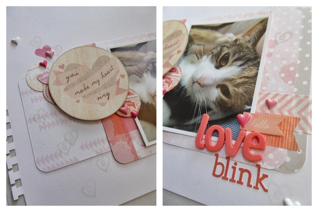
Love Blink

It feels like forever since I’ve posted anything! Not sure that two weeks counts as forever in the blogging world, but it feels that way. Life got busy, my studio got turned upside down, and it took way longer for me to get things back to normal. My space is still a mess – now of regular projects and all the christmas supplies I’ve pulled out for holiday projects, but it’s a good mess. The kind of mess that just invites cutting and gluing and all sorts of creative play.

Today’s layout was a quick one. It was my first layout in a couple weeks and it always takes me a layout or two to get back in the groove of things. If someone tells you that creativity is effortless – it’s not! I grabbed a few supplies and tried not to overthink it. I might change it up in the future, but it’s going in the album just like this for now. I love the squinty look my cat gives me when she’s content. It’s as though she’s so mellow and carefree that she can only pull off half a blink. More than the layout, that photo – the memory, is what I want in my album.

Love Blink

tlun 2014-09 love blink 04

The patterned papers are all Project Life cards, and I used dimensional stickers and foam dots to add dimension. I kept to a narrow colourway of white, grey, and shades of pink and coral, and I used two different fonts to add some subtle interest.


Products:

  • Becky Higgins Project Life, Dear Lizzy and Dreamy core kits
  • EK Success, Sticko, dimensional heart stickers
  • Crate Paper, Oh Darling, Accent Stickers
  • Prima, Delight, Journaling Spot Stickers
  • Basic Grey, Spice Market, letter stickers
  • American Crafts, Dear Lizzy, Thickers, Cordial
  • Recollections, two-inch circle punch
  • EK Success, notebook edge punch
  • My Mind’s Eye, Cut & Paste, Snapshots decorative stamps
  • Versa Color, Chateau Grey
  • Tim Holtz, Distress Ink, Pumice Stone
  • Ranger, Foam Blending Tool
  • Bella Blvd, Pink Chevron washi
  • Scotch Expressions, washi

Finland

Wanna know a secret…? That’s my layout in Jot magazine! And it’s a 12×12 layout – knock me over!!

I’m a huge fan of Jot. They have an amazing amount of inspiring content from all over the world, and they cover a variety of current topics. Instagram, mobile photography and editing, Project Life, traditional scrapbooking, mini books, gifts and packaging…. They cover all of the things that the “modern day memory keeper” is interested in.

They had a submission call for their 7th issue, but they needed layouts that were 12×12. Time to see if I could put together something. Let me tell you, 12×12 feels like a LOT of space after working on 8×8 layouts.

Finland

Finland

tlun 2014-08 finland12x12 04

So every once in a while one of my Project Life / pocket page style albums needs a title page, feature page, or I have something extra special (or large), to document. In this case, my Finland travel album needed a title page. I have so many (as in don’t-ask-how-many), photos for that album (those albums). Pocket pages are the only way I stand a chance of getting them into albums while still being able to include journalling, embellishments, and ephemera.


Products:

  • American Crafts white cardstock
  • Basic Grey, Capture, Snippets
  • Basic Grey, Carte Postale, mixed brads
  • My Mind’s Eye, Necessities “Blues” decorative brads
  • My Mind’s Eye, Necessities “Blues” enamel dots
  • My Mind’s Eye, Now and Then, Izzy “Good Times” Journey
  • My Mind’s Eye, Now and Then, Milo “Inspired” enamel dots
  • October Afternoon, Daily Flash, Tropical Sherbet washi
  • October Afternoon, Sprinklers, Farmhouse “Screen Door”
  • October Afternoon, Travel Girl, Hand Cut Alpha Stickers
  • October Afternoon, Travel Girl, Miscellany
  • October Afternoon, Travel Girl, Plane Ticket
  • October Afternoon, Travel Girl, Room Key
  • October Afternoon, Travel Girl, Word Stickers
  • Studio Calico, Die Cut Plastic Arrows
  • Tim Holtz, Tiny Attacher
  • Versafine, Black
  • date stamp, grey stripe washi