Back in 2005, we went on a road trip through parts of New York, Pennsylvania, and Ohio. Near the end of the trip we decided to stop and stretch our legs, and the map (no GPS – we did this old school…lol) showed there was a park nearby. We pulled into Presque Isle State Park. What a find! It’s on the south shore of Lake Erie, about halfway between Cleveland and Buffalo, and almost directly south of Long Point Provincial Park, in Ontario.
For anyone who’s been to and loves Long Point, you will love Presque Isle State Park. It’s got the same great expanse of beaches, the warm waters of Lake Erie, great opportunities to birdwatch and fish, and lots of places to put in a canoe or kayak and explore around the shores. It’s got one thing that Long Point doesn’t have enough of though – public beaches. Long point has a couple of public beaches – Presque Isle has a dozen, and they all have lifeguards during daytime hours. The park is really open and allows everyone to access and explore everything that exists there.
Just another quick note – there is amazing history associated with the area. So if you like military history, American history, naval history, or have a love of lighthouses, it’s a great place to look around.
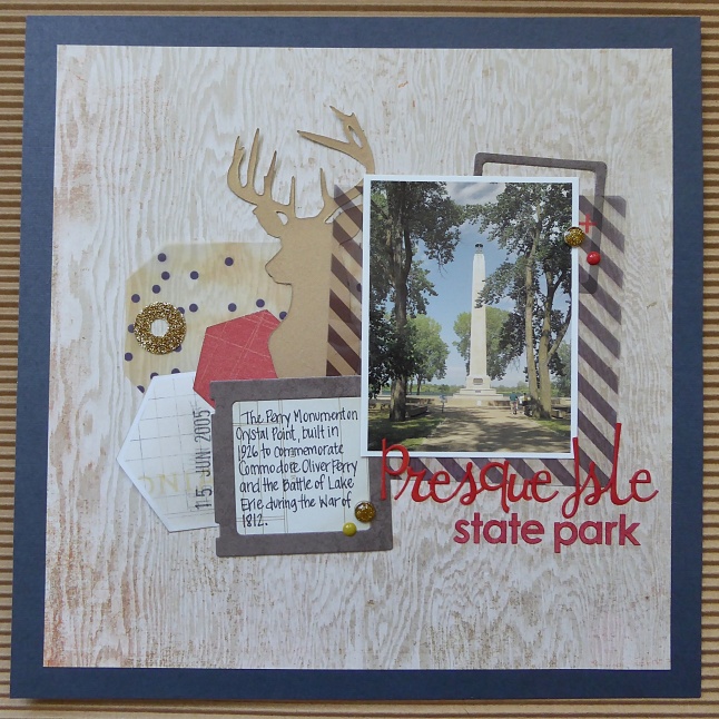
Presque Isle State Park
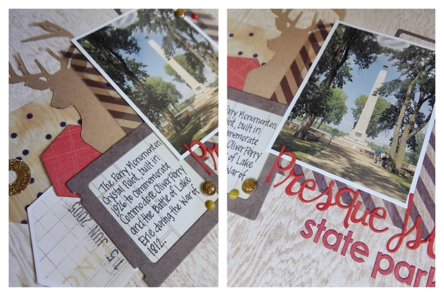
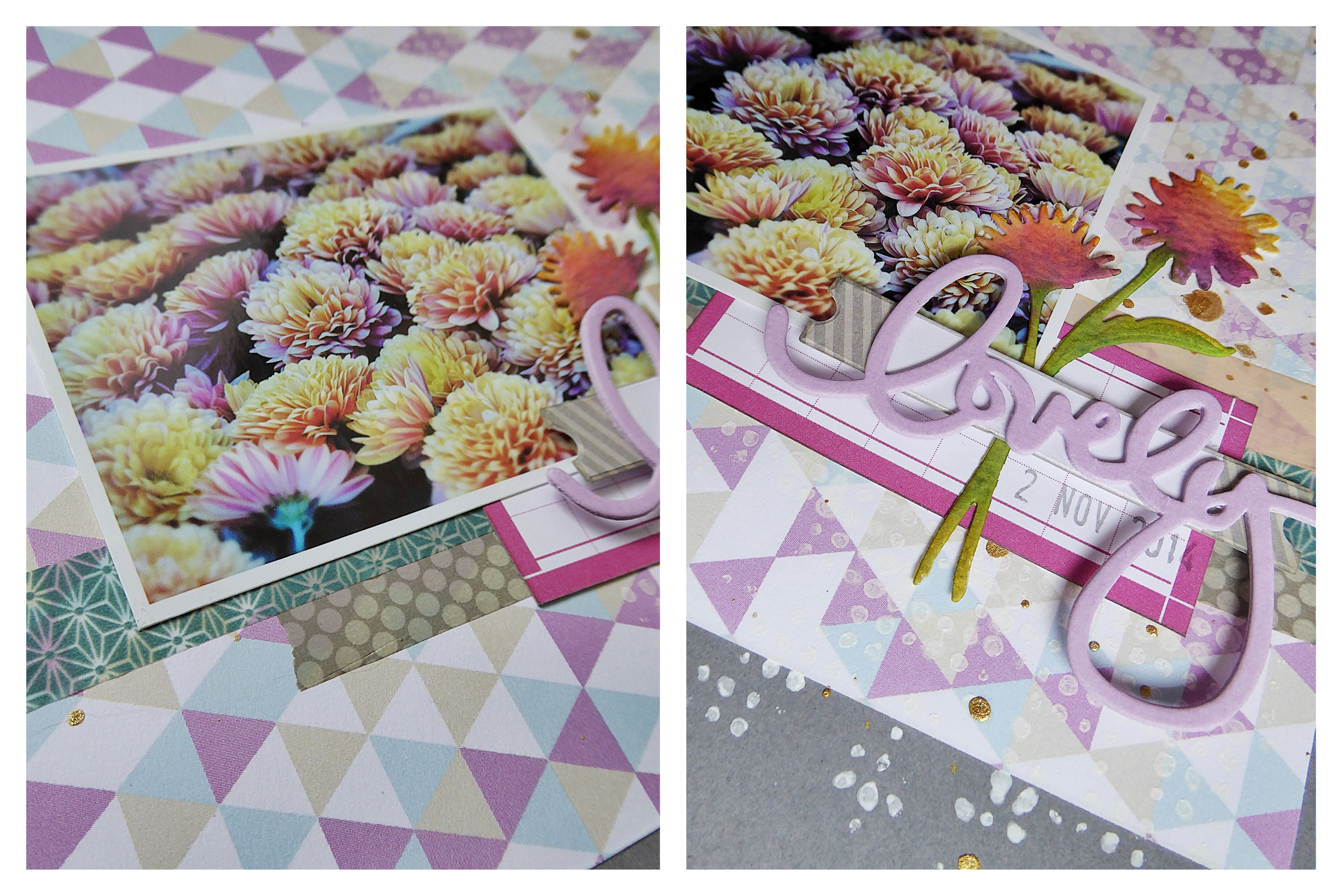
I’ve been trying to make a dent in the box of scraps that I can’t bring myself to get rid of, and this layout was made almost entirely of scraps. The navy cardstock and the photo overlay (under the photo), were the only pieces that didn’t come from the scrap bin – everything else was repurposed. I do almost exclusively 8×8 layouts, so I have a lot of decent sized scraps and I love how punches and dies let me get so much more out of papers.
This is another layout where I used Copics to change the colour of letter stickers too. I love that trick. It means I can buy stickers that are on sale (score!), or that are a font I love but in a colour I’d never use, and know that I will be able to make them work. The script letter stickers were an orange colour and the others were white, and I changed them both using just two Copic markers. Using Copics lets me blend colours and add gradation if I want, but I’m sure other types of markers would work as well. I plan on trying some Distress Inks – those vibrant colours would be gorgeous, and I’ll be sure to post how they turn out.
Products:
- American Crafts, navy cardstock
- Crate Paper, Close Knit, photo overlays
- Crate Paper, Maggie Holmes, Open Book dies
- We R Memory Keepers, Evolution Advanced die cutting machine
- Fiskars, Hexagon Punch, medium
- Sookwang, Scor-Tape
- Martha Stewart, gold glitter
- October Afternoon, Daily Flash Alpha, Bonfire “Story Book”
- Basic Grey, bas-3984, letter stickers
- Copic Markers, R27 Cadmium Red, E08 Brown
- Recollections, Fall, brads
- My Mind’s Eye, Mistletoe Magic, enamel dots
- Sharpie Pen, black