Brilliant Fallingwater

Another post about on of my favourite places. Actually, this whole month will have layouts of this place. You can check out last week’s post here.

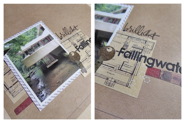
This layout includes a photo of one of the first view’s of Fallingwater you get when you walk the path from the Visitor’s Centre, down the hillside, and along Bear Run. You start by seeing parts of the home between stands of trees, and when you get to the bridge that takes you over the creek, this is what you see. Those iconic cantilevers floating over the water, before the water drops over the edge of the waterfall. It’s this moment when you realize you’re standing in front of the building you’ve seen in thousands of photographs. All of a sudden this feeling of a life size cardboard cutout coming to life floods your brain. It’s an amazing moment.

Brilliant Fallingwater

Brilliant Fallingwater

tlun 2015-03 brilliantfallingwater 04

Again, a simple layout without a lot of ornamentation. And again, a narrow colourway that references the photo. I purposely matted the photo in a paper with a pure white background instead of an off white or beige colour. I wanted the photo to stand out – to be bright and alive and in contrast with the papers of the layout. I also added in a few white rub-on details just to confirm that I purposely chose white.


Products:

  • Authentique, Hope, Foundation One
  • Sticko, Nostalgiques by Rebecca Sower, architecture stickers
  • Basic Grey, bas-3984, letter stickers
  • Basic Grey, Transfers “Obscure”, rub-ons
  • Heidi Swapp, “Brilliant” clear stamp
  • Tsukineko, VersaFine, Onyx Black ink
  • Tsukineko, VersaColor, 171 Pinecone ink
  • Tsukineko, VersaMark, Watermark ink
  • Staedtler, Triplus Fineliner, light grey
  • date stamp

Fallingwater Cafe

A little warning – this post will be longer than most. I love, always have loved, Frank Lloyd Wright and Fallingwater, and tend to ramble when I come across a chance to talk about them. :)

During the road trip of 2005, we also visited Frank Lloyd Wright’s most famous design, Fallingwater, near Mill Run, Pennsylvania. It consistently makes the lists for places to visit before you die and most recognizable buildings in the world, has been featured on the cover of Time Magazine, and has recently been nominated to be placed on UNESCO’s World Heritage Sites list. The home, and Wright, provided inspiration for the Vandamm residence in Alfred Hitchcock’s North By Northwest, and inspired Ayn Rand when she created the character of Howard Roark in Fountainhead. It is a captivating piece of architecture that includes design elements that continue to be on the edge of what is happening now. It’s timeless, and gorgeous, and anyone who loves architecture or design will love how the site is cared for and protected.

It’s set up so that you can walk through the main home and the guest house with a guide. The guides are wonderful – they know the history, the facts, the rumours, the stories, and it’s obvious they have a passion for the place. There are also trails on the grounds that you can walk along unescorted, and getting to see the home from various points on the hills around Bear Run.

We opted to buy tickets for the longer tour that allowed visitors to take photographs and I’m so glad we did. We also set aside the whole day to be there, and that let us wander the paths and enjoy some time in the beautiful Visitor’s Centre. The Centre is in a pavilion designed by Spanish architect Paul Mayén. It too has been recognized for how well it blends in with it’s surroundings, and is the perfect compliment to the site and to Wright’s intentions for it. There is also a lovely cafe and gift shop, and places to sit and relax before or after your walk.

Fallingwater Cafe

Fallingwater Cafe

tlun 2015-03 fallingwatercafe 04

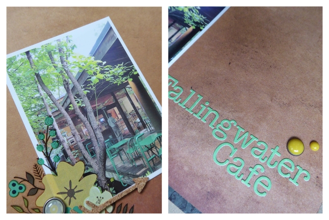
I made such a simple layout for this photo. Partially because images from this day bring up so many full memories that I don’t feel the need to add much, but also because Wright disliked too much ornamentation and it felt wrong to ‘cluttering up’ something that had been so perfectly designed in the first place. Odd? Probably… :)


Products:

  • Recollections, kraft cardstock
  • Glitz Design, Uncharted Waters, Scallop
  • Teresa Collins, Nine & Co., Rub-Ons
  • Jenni Bowlin Studio, Canning Jar Fun, Rub-Ons
  • Basic Grey, letter stickers
  • American Crafts, DIY Shop, Cork Sticker Arrows
  • Ranger Foam Blending Tool
  • Tim Holtz, Distress Ink, Pumice Stone
  • My Mind’s Eye, The Sweetest Thing, Bluebell, round brads
  • My Mind’s Eye, The Sweetest Thing, Bluebell, enamel dots
  • My Mind’s Eye, Now And Then “Milo”, Inspired, enamel dots
  • My Mind’s Eye, Collectable, Notable “Cute”, enamel dots
  • Tsukineko, Memento, Tuxedo Black ink


Lake Erie

This is another photograph taken at Presque Isle State Park (check out last week’s layout here). This was a beach at the east end of the park, that just sort of appeared between the trees while we were walking the trail and looking at the lighthouse. It was such an incredibly hot summer day. I still don’t know why this beach was empty, except that maybe it was so hot that everyone stopped at one of the many other beaches that we passed earlier on the trail.

Lake Erie

Lake Erie

tlun 2015-03 lakeerie 04

I find that one of my habits is the use of limited colourways in my layouts. It’s a look I like, and it’s something that comes easily for me. Using shades of brown and blue-green were a natural fit for this photo. To avoid having a narrow colourway look too simple, I always use a variety of shades. The browns include everything from a pale, off white beige, to a deep, cocoa brown. The blue-greens range from an almost true green to a turquoise. That variety helps add dimension, and the use of multiple patterns helps add interest. Everything from solids, to geometrics, to textures, to florals. They all add lines and weights that keeps your eye engaged.


Products:

  • American Crafts, white cardstock
  • We R Memory Keepers, Simply Spring, Sprout
  • We R Memory Keepers, Albums Made Easy, Dictate Journalling Cards
  • Crate Paper, The Open Road, Chipboard Frames
  • Basic Grey, Capture, Designer Chipboard Stickers
  • Amy Tan, Remarks, Noteworthy, Accent & Phrase sticker book
  • Crate Paper, Maggie Holmes, Accent Stickers
  • Becky Higgins, Project Life, Alpha Stickers
  • My Mind’s Eye, Lost & Found, Record It!, Antique enamel dots
  • Studio Calico, Mister Huey’s Color Mist, Clay

Presque Isle State Park

Back in 2005, we went on a road trip through parts of New York, Pennsylvania, and Ohio. Near the end of the trip we decided to stop and stretch our legs, and the map (no GPS – we did this old school…lol) showed there was a park nearby. We pulled into Presque Isle State Park. What a find! It’s on the south shore of Lake Erie, about halfway between Cleveland and Buffalo, and almost directly south of Long Point Provincial Park, in Ontario.

For anyone who’s been to and loves Long Point, you will love Presque Isle State Park. It’s got the same great expanse of beaches, the warm waters of Lake Erie, great opportunities to birdwatch and fish, and lots of places to put in a canoe or kayak and explore around the shores. It’s got one thing that Long Point doesn’t have enough of though – public beaches. Long point has a couple of public beaches – Presque Isle has a dozen, and they all have lifeguards during daytime hours. The park is really open and allows everyone to access and explore everything that exists there.

Just another quick note – there is amazing history associated with the area. So if you like military history, American history, naval history, or have a love of lighthouses, it’s a great place to look around.

Presque Isle State Park

Presque Isle State Park

tlun 2015-03 presqueisle 04

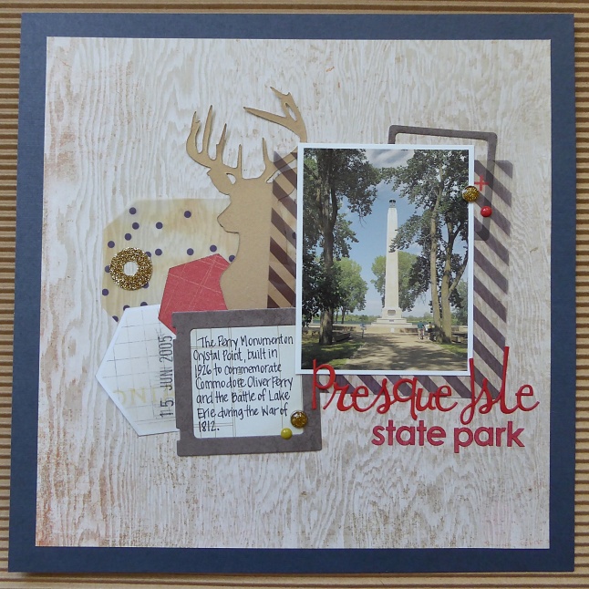
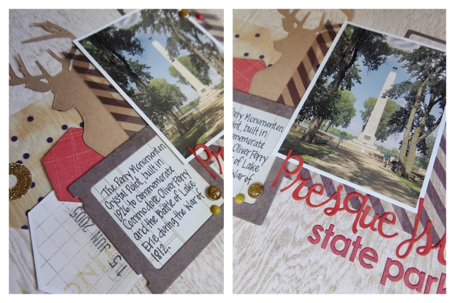
I’ve been trying to make a dent in the box of scraps that I can’t bring myself to get rid of, and this layout was made almost entirely of scraps. The navy cardstock and the photo overlay (under the photo), were the only pieces that didn’t come from the scrap bin – everything else was repurposed. I do almost exclusively 8×8 layouts, so I have a lot of decent sized scraps and I love how punches and dies let me get so much more out of papers.

This is another layout where I used Copics to change the colour of letter stickers too. I love that trick. It means I can buy stickers that are on sale (score!), or that are a font I love but in a colour I’d never use, and know that I will be able to make them work. The script letter stickers were an orange colour and the others were white, and I changed them both using just two Copic markers. Using Copics lets me blend colours and add gradation if I want, but I’m sure other types of markers would work as well. I plan on trying some Distress Inks – those vibrant colours would be gorgeous, and I’ll be sure to post how they turn out.


Products:

  • American Crafts, navy cardstock
  • Crate Paper, Close Knit, photo overlays
  • Crate Paper, Maggie Holmes, Open Book dies
  • We R Memory Keepers, Evolution Advanced die cutting machine
  • Fiskars, Hexagon Punch, medium
  • Sookwang, Scor-Tape
  • Martha Stewart, gold glitter
  • October Afternoon, Daily Flash Alpha, Bonfire “Story Book”
  • Basic Grey, bas-3984, letter stickers
  • Copic Markers, R27 Cadmium Red, E08 Brown
  • Recollections, Fall, brads
  • My Mind’s Eye, Mistletoe Magic, enamel dots
  • Sharpie Pen, black

Bloom & Grow

This is another photograph that I took at the Floral Showhouse in Niagara Falls that I mentioned last week. The variety of mums that were on display was amazing. I love the lines and geometric feel of the spider mums – so incredible all the shapes that occur in nature.

Bloom & Grow

Bloom & Grow

tlun 2015-03 bloomandgrow 04I wanted to create a geometric and graphic layout to go along with this photo, and the black, white, and gold, art deco style print was exactly what I was looking for. I didn’t want the layout to be too dark, so I added in a grey and pale cream geometric, and some crisp, pure white. I like sticking to fairly narrow colourways (although I do try and push myself out of that habit every once in a while), but not with this layout. The black, grey, cream, and white, with small touches of yellow and gold, perfectly fit the mood I wanted. And the variety of neutral rhinestones adds interest without adding distraction – and I just love the bit of sparkle and dimension they bring.


Products:

  • American Crafts, white cardstock
  • Crate Paper, Notes & Things, Memo
  • Basic Grey, Aurora, Cassiopeia
  • Recollections, vellum
  • Basic Grey, Aurora, Die Cut Cardstock & Transparencies
  • Basic Grey, Chip Stickers, Cappella
  • American Crafts, Thickers, “Cecily” silver
  • Heidi Swapp, Color Shine, Bronzer
  • Zig, Wink of Stella, clear
  • Lawn Fawn, Smitty’s ABC’s, alphabet clear stamps
  • Tsukineko, Memento, Tuxedo Black ink
  • Tim Holtz, Tiny Attacher
  • Imaginisce, rhinestone heat setting tool
  • Imaginisce, heat set pearl rhinestones
  • misc rhinestones
  • date stamp
  • black photo corners

Moon Over Niagara

We decided to take a quick trip to Niagara Falls for lunch one Sunday. It was a lovely day to be there – clear skies, crisp air, and every change of the light was beautiful. One of the special things about living close to the Falls is getting to see them at different times of day and different times of the year. Seeing them in the middle of summer with huge crowds moving around, all the sounds and colours, is exciting. Seeing them on a day when there are only a few people out, you get the chance to be still and notice the sound of the water and how the mist changes. On this day, we sat just before the brink of the falls and watched as the sky changed colour and the moon came up. It was easy to appreciate just why this is a wonder of the world.

Moon Over Niagara

Moon Over Niagara

tlun 2015-01 moonoverniagara 04

I wanted to create a layout that avoided the typical blues and nature items I would have normally reached for. I wanted to pick things that tied in to my thoughts on that day. Feathers reminded me of how the mist floated up into the air, and doilies reminded me of how this has been a special place for centuries. I cut out some of the hexagons and used distress inks to colour the paper behind them. I suppose the idea of something below the surface ties in to the river as well.


Products:

  • American Crafts white cardstock
  • Webster’s Pages, Alisson Kreft, Composition & Color, Chalk Prints
  • Wilton 4″ doilies
  • Studio Calico wood veneer feathers
  • Starform, border stickers
  • Basic Grey, BAS-3984 letter stickers
  • Basic Grey, Oliver, Micro Mini letter stickers
  • Copic, B34 Manganese Blue
  • Studio Calico, Mister Huey’s Mist: Opaque White, Shine
  • Tim Holtz, Distress Inks: Weathered Wood, Faded Jeans, Wild Honey
  • Ranger, Foam Blending Tool
  • Studio L2E, Labels & Tags, clear stamps
  • Memento, Tuxedo dye ink
  • Recollections, 1-1/2″ Circle punch
  • misc: washi tape, date stamp, ATG, Tombow Mono Multi, Fiskars Trimmer


Elixir: Pipilotti Rist

I went to see Pipilotti Rist’s art exhibit, Elixir, when it was installed at the Kiasma Museum of Contemporary Art in Helsinki, Finland. It was stunning and unlike anything else I’ve ever seen.

From the moment you walk in, when you’re asked to take your shoes off, you are immersed in the exhibit. There are carpets for you to sit on and watch the video projected on the walls, and long snake-like cushions to rest your head on while you lie back to watch the images projected on the ceiling. Bottles hang from branches that are suspended from the ceiling, and their shadows overlap and merge with the video. Each section of the exhibit is different, but they’re all connected and it feels very natural to wander from one part to the other. It is timeless and relaxing, while stimulating and thought provoking at the the same time. I don’t have the words to explain how it feels to be in the installation – which does’t make for a good blog post. The artist says, “Elixir can be medication for the mind… a hospital for the mind and the spirit.” That is probably the best description.

If you want to hear Pipilotti Rist speaking Elixir, and see a few images of the exhibit, you can click here to watch a short video.

Elixir: Pipilotti Rist

Elixir: Pipilotti Rist

tlun 2014-09 elixirpipilottirist 04I love bokeh prints and vellum, and this was the perfect layout to use them both on. It can be hard to create any air, ethereal feel with papers, and using photos that have so much dark and shadow in them didn’t make it any easier. I decided to use as many translucent elements as I could, and to mat the photos on black cardstock so that it didn’t look as though I was completely ignoring such a obvious part of the photos. I cut the elongated gold diamonds from some office file folders that happened to be the colours I was working with.


Products:

  • Webster’s Pages, Strawberry Fields, Field of Gold
  • Crate Paper, Flea Market, bokeh vellum
  • Studio Calico, plastic die cut arrows
  • sequins
  • Ranger, Glossy Accents
  • Basic Grey, Spice Market, letter stickers
  • Fancy Pants, Burlap & Bouquets, Sticker Fundamentals
  • Scotch, washi
  • Tim Holtz, Distress Ink, Pumice Stone
  • Ranger, Foam Blending Tool
  • Wink Of Stella, Clear


Love Blink

It feels like forever since I’ve posted anything! Not sure that two weeks counts as forever in the blogging world, but it feels that way. Life got busy, my studio got turned upside down, and it took way longer for me to get things back to normal. My space is still a mess – now of regular projects and all the christmas supplies I’ve pulled out for holiday projects, but it’s a good mess. The kind of mess that just invites cutting and gluing and all sorts of creative play.

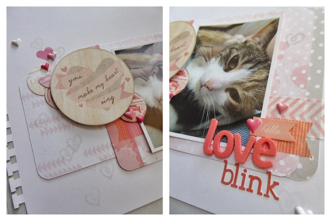
Today’s layout was a quick one. It was my first layout in a couple weeks and it always takes me a layout or two to get back in the groove of things. If someone tells you that creativity is effortless – it’s not! I grabbed a few supplies and tried not to overthink it. I might change it up in the future, but it’s going in the album just like this for now. I love the squinty look my cat gives me when she’s content. It’s as though she’s so mellow and carefree that she can only pull off half a blink. More than the layout, that photo – the memory, is what I want in my album.

Love Blink

tlun 2014-09 love blink 04

The patterned papers are all Project Life cards, and I used dimensional stickers and foam dots to add dimension. I kept to a narrow colourway of white, grey, and shades of pink and coral, and I used two different fonts to add some subtle interest.


Products:

  • Becky Higgins Project Life, Dear Lizzy and Dreamy core kits
  • EK Success, Sticko, dimensional heart stickers
  • Crate Paper, Oh Darling, Accent Stickers
  • Prima, Delight, Journaling Spot Stickers
  • Basic Grey, Spice Market, letter stickers
  • American Crafts, Dear Lizzy, Thickers, Cordial
  • Recollections, two-inch circle punch
  • EK Success, notebook edge punch
  • My Mind’s Eye, Cut & Paste, Snapshots decorative stamps
  • Versa Color, Chateau Grey
  • Tim Holtz, Distress Ink, Pumice Stone
  • Ranger, Foam Blending Tool
  • Bella Blvd, Pink Chevron washi
  • Scotch Expressions, washi