Let Your Light Shine

In the past couple of years, there have been a lot of ladybugs in our neighbourhood in the late fall. Every once in a while one will get in the house, and my cat loves when that happens. She’s not much of a hunter though. I once watched her calmly look on as one climbed onto her paw and then she went right back to napping. She does like to play chase though, so when the lady bug flew inside the lampshade – the game was on! She was gentle enough that the lamp slowly tipped against the bookshelf and didn’t crash down. After that, she happily joined the little bug inside the shade.

Let Your Light Shine

Let Your Light Shine

tlun 2015-01 letyourlightshine 04

I bought some gesso and wanted to make a layout with some mixed media. I used a technique I saw Irit Landgraf use for getting a lovely smear of colour onto the page – put ink or paint onto some plastic packaging, add in a bit of water, mix, and press it onto your page. You can move around the ink by pressing on the back of packaging while it’s pressed against the paper. It leaves great colour with different gradations, and without the fuss of brushes or brush marks. She does amazing mixed media layouts and shares tips and techniques in her videos – check her out.

I added some gelatos and stamped images on top of the gesso, and I was happy with how it turned out. Most of it ended up hidden, but little bits peek out here and there. I found some scraps with the colours I wanted and cut out pieces that had light and electrical illustrations on them. I love when scraps end up being a perfect fit like that. I didn’t have such luck with finding letters for the title though. I ended up cutting four sets of the letters from black cardstock, gluing them together, and adding Glossy Accents on top.


Products:

  • American Crafts, white cardstock
  • Recollections, black cardstock
  • Faber-Castell Gesso
  • Faber-Castell, Gelato, gold
  • Studio Calico, Mister Huey’s, Clay mist
  • My Mind’s Eye, Necessities, Triangle Vellum Gold
  • Tim Holtz, Distress Ink, Pumice
  • Ranger, Foam Blending Tool
  • Heidi Swapp, Let Your Light Shine, clear stamp
  • VersaMark, Watermark ink
  • Wow, Primary Ebony Regular embossing powder
  • Marvy Uchida heat gun
  • Lawn Fawn, Smitty’s ABC’s, clear alphabet stamp set
  • VersaFine, Onyx Black ink
  • Memento, Tuxedo Black dye ink
  • WRMK Evolution Advanced
  • QuicKutz, “Lucy” Classic Alphabet Set
  • Tomboy Mono Multi liquid glue
  • Ranger, Glossy Accents
  • Tim Holtz, Tiny Attacher
  • misc: washi tape, cat paper clip, sequins, ATG, Fiskars trimmer


Elixir: Pipilotti Rist

I went to see Pipilotti Rist’s art exhibit, Elixir, when it was installed at the Kiasma Museum of Contemporary Art in Helsinki, Finland. It was stunning and unlike anything else I’ve ever seen.

From the moment you walk in, when you’re asked to take your shoes off, you are immersed in the exhibit. There are carpets for you to sit on and watch the video projected on the walls, and long snake-like cushions to rest your head on while you lie back to watch the images projected on the ceiling. Bottles hang from branches that are suspended from the ceiling, and their shadows overlap and merge with the video. Each section of the exhibit is different, but they’re all connected and it feels very natural to wander from one part to the other. It is timeless and relaxing, while stimulating and thought provoking at the the same time. I don’t have the words to explain how it feels to be in the installation – which does’t make for a good blog post. The artist says, “Elixir can be medication for the mind… a hospital for the mind and the spirit.” That is probably the best description.

If you want to hear Pipilotti Rist speaking Elixir, and see a few images of the exhibit, you can click here to watch a short video.

Elixir: Pipilotti Rist

Elixir: Pipilotti Rist

tlun 2014-09 elixirpipilottirist 04I love bokeh prints and vellum, and this was the perfect layout to use them both on. It can be hard to create any air, ethereal feel with papers, and using photos that have so much dark and shadow in them didn’t make it any easier. I decided to use as many translucent elements as I could, and to mat the photos on black cardstock so that it didn’t look as though I was completely ignoring such a obvious part of the photos. I cut the elongated gold diamonds from some office file folders that happened to be the colours I was working with.


Products:

  • Webster’s Pages, Strawberry Fields, Field of Gold
  • Crate Paper, Flea Market, bokeh vellum
  • Studio Calico, plastic die cut arrows
  • sequins
  • Ranger, Glossy Accents
  • Basic Grey, Spice Market, letter stickers
  • Fancy Pants, Burlap & Bouquets, Sticker Fundamentals
  • Scotch, washi
  • Tim Holtz, Distress Ink, Pumice Stone
  • Ranger, Foam Blending Tool
  • Wink Of Stella, Clear


Fergus Fair

The Fergus Fall Fair is a great one to visit. I didn’t get the chance to go this year, but I have a bunch of photos from our visit last year that I hadn’t done anything with. When looking at September’s Mood Board, I knew I had the perfect excuse to go through those photos and make a layout.

Fergus Fair

Fergus Fair

tlun 2014-09 fergusfair 04

Since I had so many photos to choose from, I actually started this layout without choosing the photos first. I wanted to put together a composition and use products that would capture the feel of the mood board, and then pick photos that would work. As soon as I came across the frames from Crate Paper, I knew exactly how I could do that. I ended up choosing photos that could hold their own against all the embellishments on the page – ones that were close ups of a single subject, and that had a very narrow colourway. The almost monotone colours in the photos (creams, tans, browns, greys), helps set those frames apart and draw your eye to the photos, even though there are lots of possible distractions on this layout.

I wanted to mention that the foil letter stickers are great quality. The wrinkles and creases that are in mine are because of a curious cat that nibbled on them while there were stuck to the ruler I was using to lay them out :) You do see texture through the stickers, but they come off the sheets without any problem, and without any creasing.


Products:

  • American Crafts, white cardstock
  • Pebbles, Birthday Wishes, You’re Invited
  • Webster’s Pages, Ocean Melody, Ocean View
  • Glitz Design, Uncharted Waters, 8×8 paper pad
  • Crate Paper, The Open Road, Frames
  • Crate Paper, The Open Road, Ephemera Pack
  • Crate Paper, Maggie Holmes Styleboard, Ephemera Pack
  • Crate Paper, Oh Darling, Ephemera Pack
  • Heidi Swapp, Color Magic, letter stickers
  • Recollections, foil alphabet stickers
  • Studio Calico, Tiny Type Stickers
  • Mambi, Sticks stickers
  • Studio Calico, Mister Huey’s, Boss Lady
  • Studio Calico, Mister Huey’s, Sherbet
  • Studio Calico, Mister Huey’s, Buttercup
  • Studio Calico, Mister Huey’s, Bookworm
  • Studio Calico, Mister Huey’s, Opaque White
  • October Afternoon, Sprinklers, Woodland Park, Springs
  • Tim Holtz, Tiny Attacher
  • Ranger, Glossy Accents
  • Tsukineko, VersaFine, Onyx Black ink
  • date stamp, sequins


Stockmann: Take Away Food

It’s Thursday, so that means another throwback layout. This is another one that was created as part of a challenge at Two Peas in a Bucket. I can’t remember exactly what the challenge was, but it was about using the colours blue, grass green, and lemon yellow.

Stockmann: Take Away Food

Stockmann: Take Away Food

tlun 2014-07 stockmanntakeawayfood 04The large tabs were punched from the always useful We R Memory Keeper Tab File Punch. The tag was punched using a Marvy Tag Punch. I cut the Stockmann logo and name with my Silhouette, using the software’s trace and cut feature. I love using my Silhouette for making completely personalized titles. It’s easy to do and always adds a finished look to the page.

Utsjoki

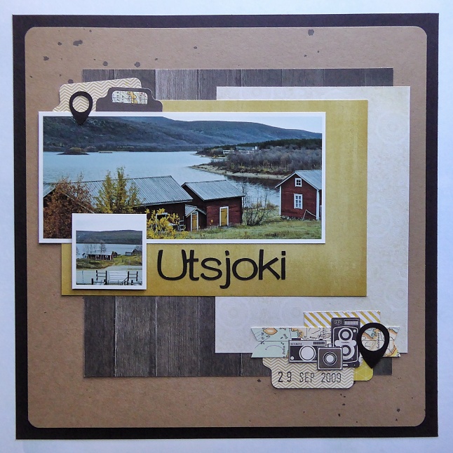
Another throwback layout for this week, with a photo from my trip through Finland. This photo was taken in Utsjoki, Finland. Curious just how far north that is? Check this out.

Utsjoki

Utsjoki

tlun 2014-07 utsjoki 04It was part of a day trip that I made from Inari, Finland. Out in the middle of what felt like nowhere, was a church and a church village from the mid-19th century. When the church was built, people would have to travel for days to attend, so they would stay in the small cabins overnight when they arrived.

This layout was part of a Two Peas in a Bucket challenge to create a layout inspired by social media. I took cues from the layout of Facebook – using a long horizontal photo near the top, with a smaller square “profile” picture over top on the left side. I included tabs as a play on computer tabs), and geotags as embellishments. Again, the largest tab is the We R Memory Keeper Tab File Punch, and the smaller one is a Quickutz die.

Finland

Wanna know a secret…? That’s my layout in Jot magazine! And it’s a 12×12 layout – knock me over!!

I’m a huge fan of Jot. They have an amazing amount of inspiring content from all over the world, and they cover a variety of current topics. Instagram, mobile photography and editing, Project Life, traditional scrapbooking, mini books, gifts and packaging…. They cover all of the things that the “modern day memory keeper” is interested in.

They had a submission call for their 7th issue, but they needed layouts that were 12×12. Time to see if I could put together something. Let me tell you, 12×12 feels like a LOT of space after working on 8×8 layouts.

Finland

Finland

tlun 2014-08 finland12x12 04

So every once in a while one of my Project Life / pocket page style albums needs a title page, feature page, or I have something extra special (or large), to document. In this case, my Finland travel album needed a title page. I have so many (as in don’t-ask-how-many), photos for that album (those albums). Pocket pages are the only way I stand a chance of getting them into albums while still being able to include journalling, embellishments, and ephemera.


Products:

  • American Crafts white cardstock
  • Basic Grey, Capture, Snippets
  • Basic Grey, Carte Postale, mixed brads
  • My Mind’s Eye, Necessities “Blues” decorative brads
  • My Mind’s Eye, Necessities “Blues” enamel dots
  • My Mind’s Eye, Now and Then, Izzy “Good Times” Journey
  • My Mind’s Eye, Now and Then, Milo “Inspired” enamel dots
  • October Afternoon, Daily Flash, Tropical Sherbet washi
  • October Afternoon, Sprinklers, Farmhouse “Screen Door”
  • October Afternoon, Travel Girl, Hand Cut Alpha Stickers
  • October Afternoon, Travel Girl, Miscellany
  • October Afternoon, Travel Girl, Plane Ticket
  • October Afternoon, Travel Girl, Room Key
  • October Afternoon, Travel Girl, Word Stickers
  • Studio Calico, Die Cut Plastic Arrows
  • Tim Holtz, Tiny Attacher
  • Versafine, Black
  • date stamp, grey stripe washi


River

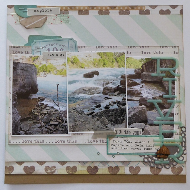
These are some of my favourite photos, that just happened to take me seven years to do anything with…LOL This was part of a Mother’s Day outing to Niagara Falls. We wanted to see some of the attractions that we hadn’t seen before, and the White Water Walk sounded like a little gem. It absolutely was! You’re right at the edge of the river and because of the gorge walls and the sound of the water, you can’t hear civilization. You get that wonderful ‘escape in the city’ feeling. It was also a hot day, and the combination of shade and mist made it a lovely break from the heat.

River

River

tlun 2014-08 river 04When I was going through all the photos I took – and I took A LOT, I couldn’t find any that I could line up to make a sort of panoramic shot. The closest I could get was these three, so I printed them out and hoped I could somehow make them work. They don’t completely line up, but tilting them at slight angles to each other helps hide that… I think…LOL I decided to also keep everything on the horizontal axis. The photos created a strong horizontal feature, and I worried that if I added vertical elements the layout would become too busy. Of course, that didn’t apply to the title. I fell in love with these letters because of their colour and translucency, but they were a bit too large for me to use on the horizontal. Putting them on the vertical also let me balance out the embellishments on the top left of the page.


Products:

  • Recollections kraft cardstock
  • Crate Paper, Maggie Holmes, Styleboard 12×12 paper pad
  • Crate Paper, Maggie Holmes, Styleboard, Sticky Notes
  • Crate Paper, Maggie Holmes, Ephemera Pack
  • Recollections, paper doily
  • Heidi Swapp, Alphabet letters
  • Studio Calico, plastic arrow
  • Studio Calico, Wood Veneer, Transportation Shapes
  • Marvy, Wood Stain Marker, Dark Brown
  • EK Success, Tag punch
  • Martha Stewart, Scalloped Circle punch
  • We R Memory Keepers, Tab File punch
  • Tim Holtz, Tiny Attacher
  • Memento, Tuxedo Black ink
  • date stamp, washi tape, vellum scraps


You Can Go Your Own Way

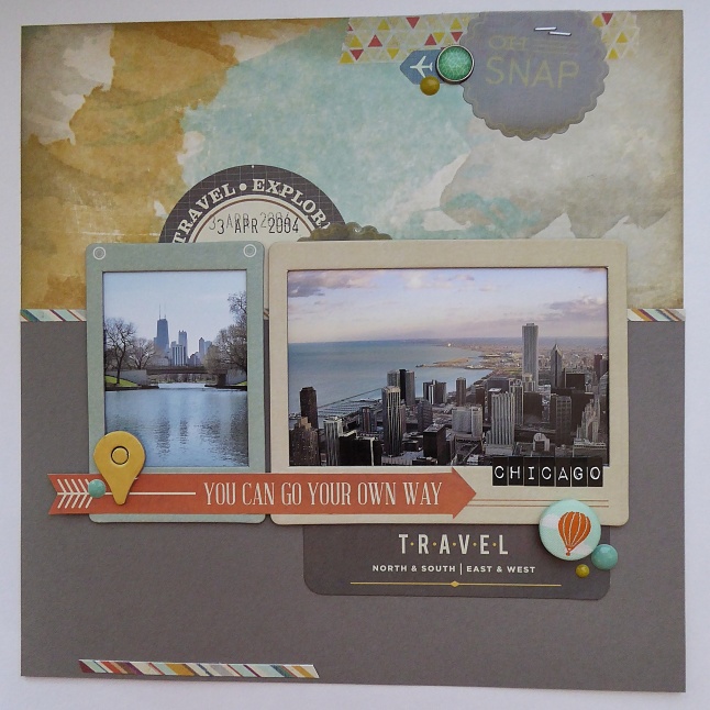
These photos were from a few years ago – well, ten years ago now, but that just makes me feel old…LOL I love a good road trip and I love Chicago, so this still is one of favourite vacations ever. I go to the Lincoln Park Zoo every time I’m there, and on this trip I went up to the observation floor of the John Hancock Centre. It was my first time seeing the city from up high and it was gorgeous. The lake and the buildings, all lit with that warm light that happens just before the sun sets – made me fall even more in love with the city.

You Can Go Your Own Way

You Can Go Your Own Way

tlun 2014-08-06 you can go your own way 04

I wanted to push myself out of my box a little with this layout. It’s very common for me to have a frame around the page and it’s rare for me to frame a photo. I decided to do the opposite and use some chipboard frames and forgo the usual frame around the whole page. As I started putting the layout together I decided to keep trying some new-to-me things. That bulky hot air balloon brad – that’s me pushing my boundaries…LOL I usually keep my embellishments fairly flat so while one brad doesn’t seem like some sort of revolution, it made me feel like a bit of a rebel.

The other thing that happened with this layout that I didn’t set out to do, was I strayed from my usual ‘three points of interest’ when I added my embellishments. At first glance there’s a triangle formed by the circular embellishments (where the enamel dots are), but then there’s a fourth circular element tucked behind the top of the photos. And then there’s that strip of striped paper (say that ten times fast), at the bottom left of the layout. It’s only one element, but it’s so high contrast that it definitely has visual weight. So this layout ended up having five spots that catch your eye.

Does it work? I think so. Even though this is an 8×8 layout, with two photos, and five ‘spots’, it doesn’t come across as too busy or distracting. So why does it work? It works because of where on the layout those ‘spots’ are. They’re all fairly restrained – not too many different colours, shapes, or number of elements in each cluster. And they are also balanced around the layout – one near the top, one near the bottom, one near the right, one near the left. This lets your eye find a balance – to find spots to rest. You can ‘see’ many different triangles though, and that keeps your eye moving and the page interesting. It’s all about a balance.


Products:

  • brown cardstock
  • We R Memory Keepers, Indian Summer, Watercolour
  • Crate Paper, The Open Road, Chipboard Frames
  • Basic Grey, Capture, Snippets
  • Basic Grey, Capture, Die Cuts
  • Basic Grey, Capture, Designer Chipboard Stickers
  • Basic Grey, Carte Postale, Mixed Brads
  • Recollections, 2-1/2″ circle punch
  • My Mind’s Eye, Mistletoe Magic, Enamel Dots
  • Tim Holtz, idea-ology, Label Letters
  • Tim Holtz, Tiny Attacher
  • Ranger, Distress Ink, Pewter
  • Memento, Tuxedo Black, ink
  • date stamp
  • washi tape


Wild Blue Yonder

This is a layout that I did a couple years ago. I used to keep track of my layouts on Two Peas in a Bucket, and it was posted there originally. I really liked the gallery there. Being able to see the progression my scrapbooking – of things I had learned, and different techniques I had tried. When Two Peas announced their closing, it was a mad scrabble for a lot of us to figure out how we would keep track of our projects. Even though we have the layouts in albums around our homes, it was always just so convenient to click through the galleries.

Wild Blue Yonder

Wild Blue Yonder

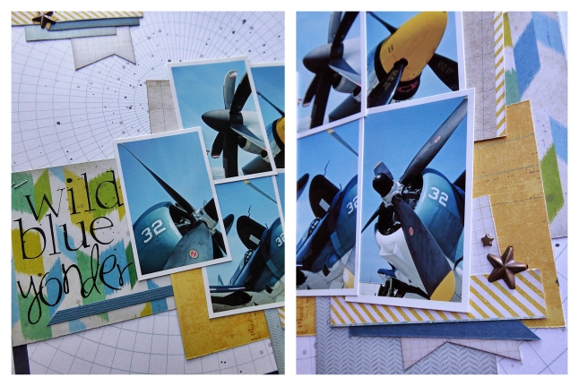
tlun 2014-07-throwback wildblueyonder 05This pattern paper (I believe it’s a Studio Calico print), jumped out at me right away. I love how the circular graph reminds me a bit of charts and maps, and how it relates to the circular nose of the airplane with the propeller blades radiating out from the center. Again with this layout, I pulled my colours from the photos. The print under the title reminds me of the way blades blur when they’re in motion, and I like the addition of green to the layout. Green softens the combination of blue and yellow, letting the bold blue and yellow of the plane stand out. This is an 8×8 layout and I’ve included five photos, so I decided to keep the embellishments simple and minimal. I kept the title simple as well – using rub-ons from Making Memories. I didn’t include any journalling in this layout, but it would be easy enough to tuck hidden journalling under the cluster of photos or a quick line or two in the upper left corner or under the title. It’s a very versatile, easy, and quick layout for including lots of photos – a layout I consider a staple.

Waiting On A Train

Today’s layout was inspired by MME’s July Sketch Challenge. I had a difficult time with this sketch. I don’t usually leave so much space between embellishments, but it’s a look I love. I thought this challenge would be a great way to push my comfort zone. It’s too early for me to say whether I’ll be using this style in future projects, but I love trying new things.

Waiting On A Train

Waiting On A Train

tlun 2014-07-22 waitingonatrain 07I decided to use three photos, and mat them on some grey and white patterned paper. In the end, I also matted the first photo on some dark teal paper because I felt like the right side of the page was too heavy. That little bit of a darker colour on the left helps to balance things out. Behind the matted photos I used some grey watercolour paint to create a puddle of colour. I used a heavyweight white cardstock so there was a bit of warping, but nothing that won’t lay flat once it’s in an album. One trick I do use for minimizing warping is to dry the paper on both sides with my heat gun. Heating from both sides means that both sides dry and shrink at the same time. Another trick is to lightly mist the back of the paper so that it expands too. Then tuck the paper under your craft mat, and stack some punches on top to weigh it all down. As the paper dries, it keeps it’s flattened shape.


Products:

  • American Crafts white cardstock
  • MME, Cut & Paste, Charm 6×6 paper pad
  • MME, My Girl, 6×6 paper pad (small chevrons)
  • MME, Collectable, Chipboard Shapes
  • MME, Lost & Found Two, Label Stickers (label edges)
  • MME, Market Street, 3×4 Double Sided Cards
  • MME, Market Street, Decorative Brads
  • MME, Necessities, Teals, Brads
  • October Afternoon, Farmhouse, Screen Door Sprinklers
  • October Afternoon, Woodland Park, Springs Sprinklers
  • Martha Stewart Label Stickers
  • Memento, Tuxedo Black ink
  • Kate Spade Rotating Stamp
  • Amy Tangerine, Yes Please, Roller Stamp
  • EK Success, Sticko, Aristocrat Alpha Sm.
  • Basic Grey, bba-4024, letter stickers